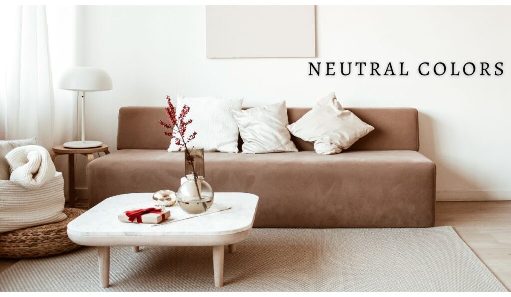
Neutral Colors- Small space decor ideas
When it comes to decorating a small space, neutral colors can work wonders. In small spaces, these muted colors can create a sense of spaciousness and airiness. In this article, we will discuss how to use neutral colors to make small spaces appear larger and brighter.

Choose the Correct Neutral Shade
When it comes to using neutral colors in small spaces, you must select the appropriate shade. Choose white, beige, gray, or taupe colors with warm undertones. Cool colors can make your room appear smaller and more confined.
Use a variety of textures
Incorporate different textures into the design to keep the neutral color scheme from looking too bland. Add a shaggy rug or textured throw pillow to a neutral-colored room, for example. Textured accent pieces and accessories will add depth and interest to the space.
Increase the Contrast
Adding contrast is another way to keep the neutral color scheme interesting. This can be accomplished by using various shades of the same color or by combining neutrals with bright or bold colors. For example, if you have a beige sofa in a neutral room, you could add a bright orange throw pillow to liven up the space.
Maintain Simplicity
It is critical to keep the design simple when using neutral colors in a small space. Stick to a few key pieces and avoid overcrowding the room with accessories. The minimalist approach will open up and air out the space.
Make the Most of Lighting
Finally, in small spaces, lighting is critical. Natural light can make a room appear larger, so keep the windows unobstructed. Allow light to filter in by using sheer curtains. Add lamps and other lighting fixtures to brighten up the space.
Using neutral colors to create the illusion of space in a small room works well. You can create a serene, elegant, and spacious environment that maximizes your available space by following these tips. A neutral color scheme can be a great choice for decorating a small apartment or a tiny room. Remember to use the right neutral shade, different textures, contrast, keep it simple, and take advantage of lighting.
